Split testing is an important tool for marketers. By running two iterations of the same campaign at once, data shows which option is the most effective at driving action.
While split—or A/B—testing is now hugely popular across email and digital marketing channels, the tactic has a long history of use in direct mail marketing. Results were, by nature, slower to come in and thus harder to act on. But today, digitally powered direct mail tells a different story that more closely aligns with the digital testing experience.
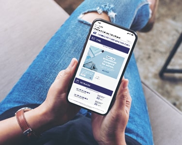
A direct mail campaign enhances its effectiveness when digital innovation is baked in. Layer an Informed Delivery campaign onto a direct mail effort to A/B test complementary messages and make a mailpiece work twice as hard.
Testing with Informed Delivery campaigns
With the free Informed Delivery campaign feature from USPS, businesses can develop complementary digital imagery to be included in a daily digest email for subscribers. This provides a second touch point for a single mailpiece, giving marketers multiple chances to drive action with one mailing.
That second touch point—after the initial Informed Delivery email arrives and before the recipient has the mailpiece in hand—can also be used to experiment with split testing, helping marketers see what messaging drives clicks directly from an email or leads to higher response rates from the physical mailpiece.
See how two businesses were able to successfully drive action using Informed Delivery A/B testing.
Case Study
Pittsburgh Pirates boost response rates by testing ride‑along images
The Pittsburgh Pirates®, a Major League Baseball organization, planned a direct mail campaign to entice people to attend an early season game. The physical mailpiece offered $5 off specific seats and used a promotional link.

The organization used an Informed Delivery campaign to test three complementary calls to action: one general message, one mentioning the discounted offer and a third teasing a free jersey with ticket purchase. Each of these messages was incorporated into a ride-along image. In an Informed Delivery campaign, ride-along images are clickable and drive consumers to take action.
General Message

Discount offer

Jersey Offer

The Pirates organization split their broader direct mail campaign into three Informed Delivery campaigns, each with one of these ride‑along CTAs.
TIP
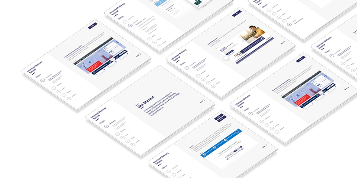
Think of a ride-along image like a branded, clickable button. Use a strong CTA that gives people a reason to click and include a simple, colorful image. Most subscribers view Informed Delivery emails on their phones, so it should be easy to understand at any scale. Try the Informed Delivery Tutorial
The testing showed that their choice of ride-along image had a notable impact on response rate. The ride-along image that mirrored the $5-off discount on the mailpiece had a response rate 9 percent higher than that of the generic “Get tickets today” CTA.
The ride-along image that included the special offer of a free jersey saw a response rate 39 percent higher than the generic CTA.
This test helped the organization understand what drove people to action. In the future, they can use these learnings to inform the messaging of their mailpieces and to create even more enticing offers for fans.
Case Study
Bono’s Pit Bar-B-Q drives clicks with representative image A/B test
Bono’s Pit Bar-B-Q, a Florida-based restaurant chain, created a direct mail campaign that offered $10 off to customers.
The business also included an Informed Delivery® campaign with their mailpiece and chose to test the effectiveness of the included image on click-to-open rates.
By default, the image that appears for a basic Informed Delivery campaign is a grayscale scan of the actual mailpiece. Marketers have the option to run a dual campaign and replace the image with a full-color one of their choosing.
Bono’s ran a basic Informed Delivery campaign for some of their mailings, using the grayscale image of the actual mailpiece along with a simple and colorful ride-along image. They also ran a dual campaign for the remaining mailings, which used a full-color representative image along with the same simple ride-along image.
Grayscale Image

Full-Color Representative Image

TIP
There are advantages to both types of images. Grayscale images show that it is an actual mailpiece because it looks like all the other scans and includes the recipient’s name and address. Representative images are colorful, eye-catching and can share more information, like showing the flip side of a mailpiece. Try the Informed Delivery Tutorial
The restaurant’s results might surprise many marketers: There was a 35 percent higher click-to-open rate among recipients of the grayscale image campaign than of the full-color representative image. Part of this success could be attributed to the strategic combination of the grayscale image and the colorful ride-along image. This clear CTA attracted the reader’s attention while the grayscale image signaled that this was an actual mailpiece that they would receive soon.
This example illustrates a larger trend: Comparing the response rates of thousands of Informed Delivery campaigns, data shows that campaigns using grayscale images have click-to-open rates that are 13 percent higher on average than those using full-color ones.
Key Takeaway
Split testing is now channel-agnostic.
This valuable tool, previously reserved for digital campaigns, is now omni-channel-friendly. Informed Delivery interactive campaigns give businesses a way to apply experimentation with messages and imagery to direct mail. Using these tools can help marketers learn about and understand their direct mail audience better, all in an effort to boost future campaigns and drive meaningful action.
Learn more about running and testing Informed Delivery interactive campaigns with our step-by-step tutorial.
 search
close
menu


